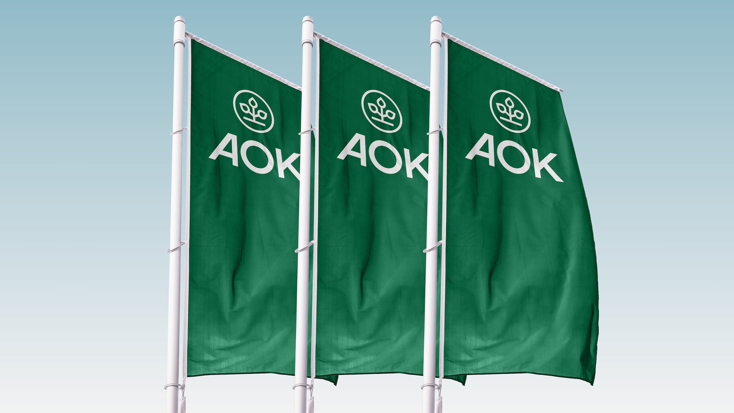
Elevating Germany’s largest health insurer


Brand design. UI/UX Design. Workshops @ MEtaDESIGNWith 27 million members, AOK is Germany’s largest health insurance provider. At MetaDesign we were asked to develop a new visual identity that elevates the brand into the 21st century.
Though iconic, the existing logo struggled in digital and confined spaces. We strenghtened the logotype and freed the “tree of life” from its constraints, ensuring greater responsiveness and prominence across different environments.
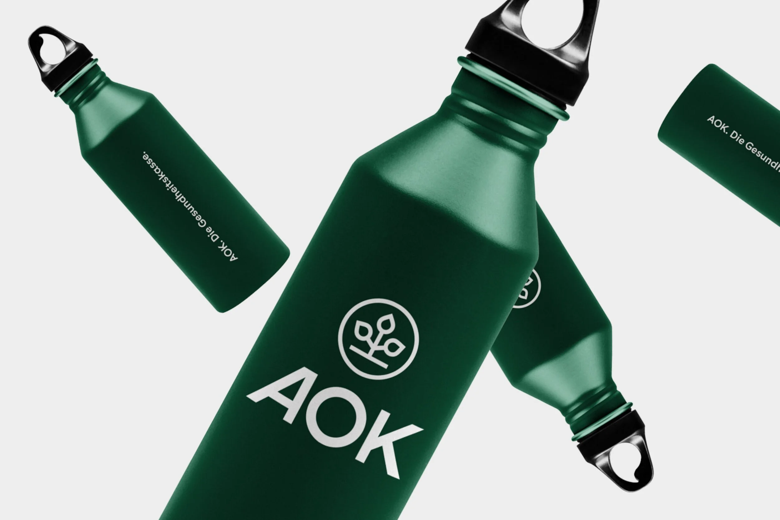
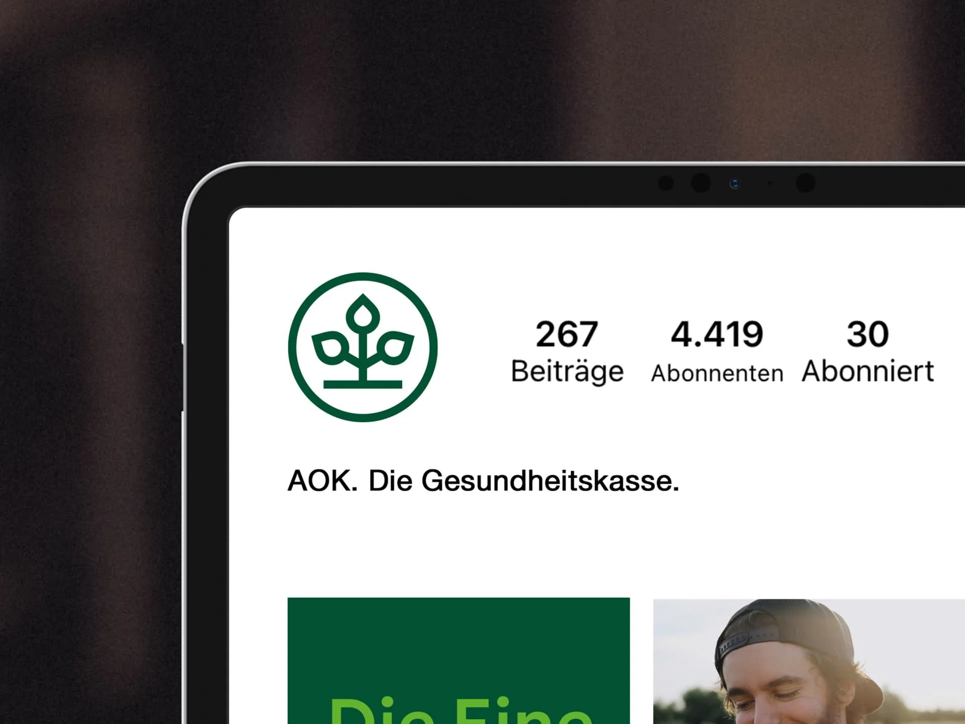
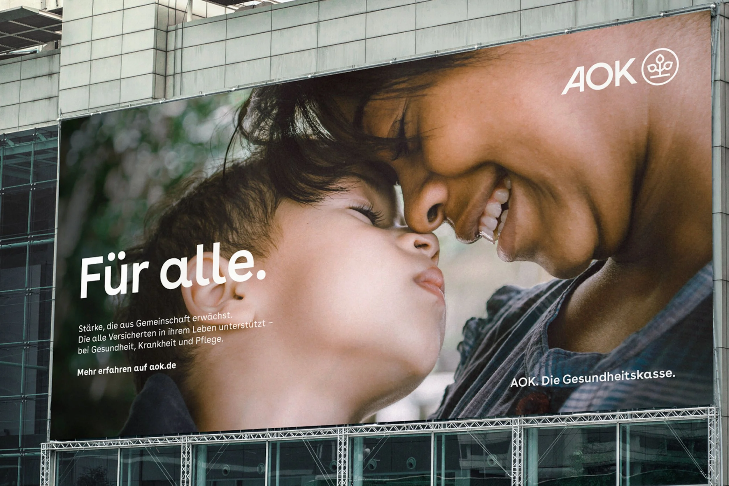
Clear and approachable: we made sure that the typeface and iconography speak the same language.
To move away from the rigidness of the past, we created an easy to use layout system that allows for more flexibility across different types of media.
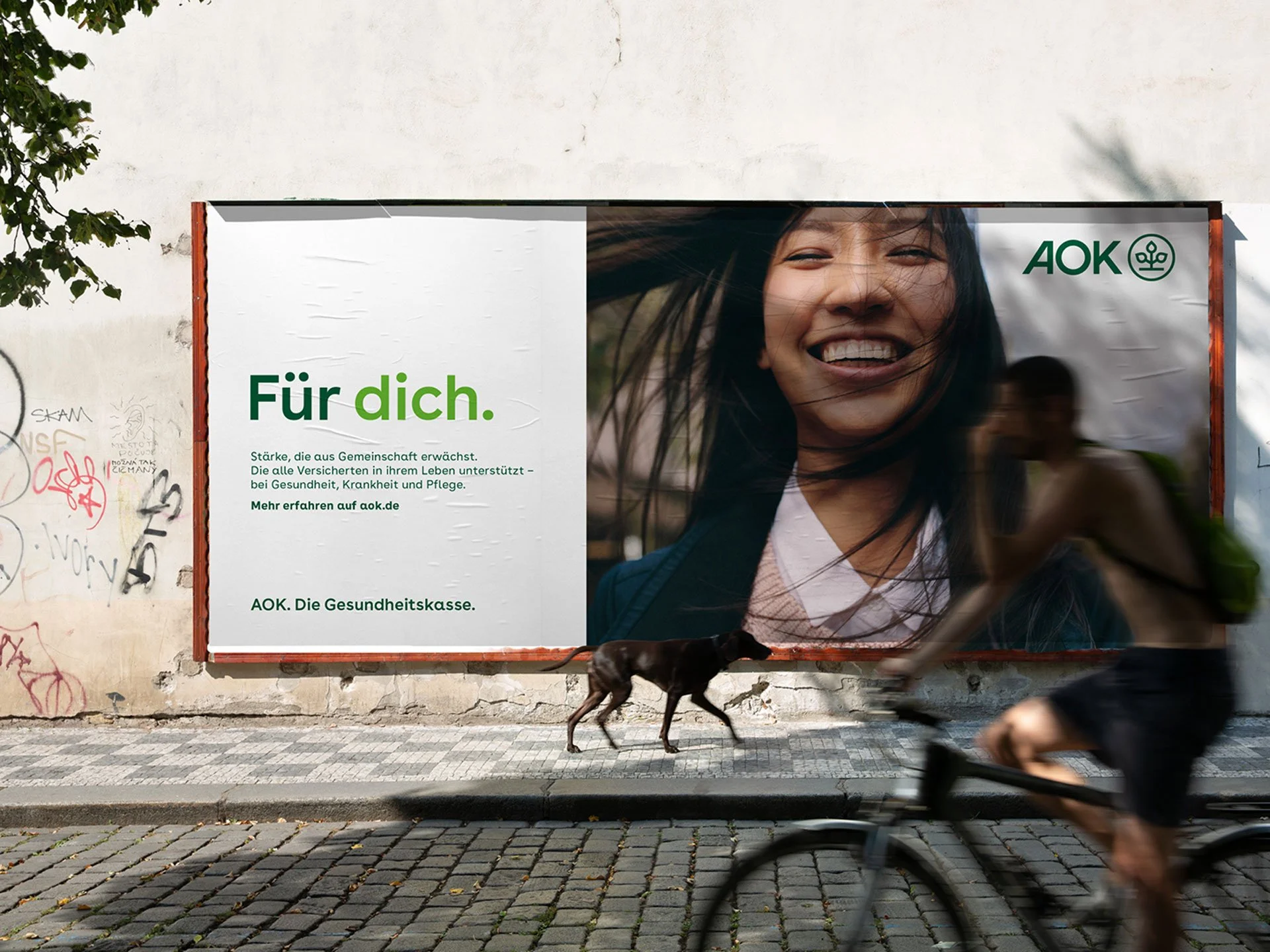
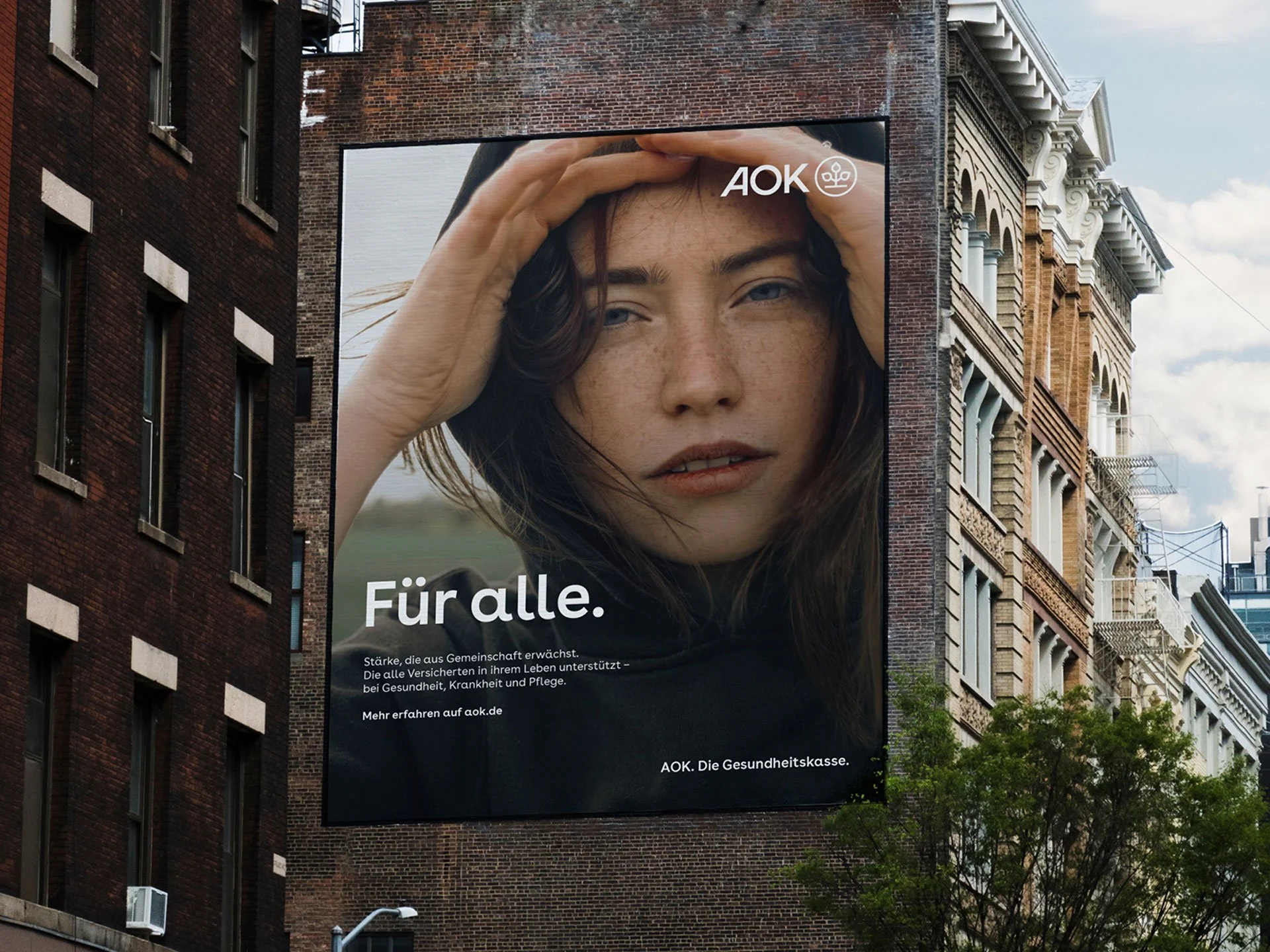
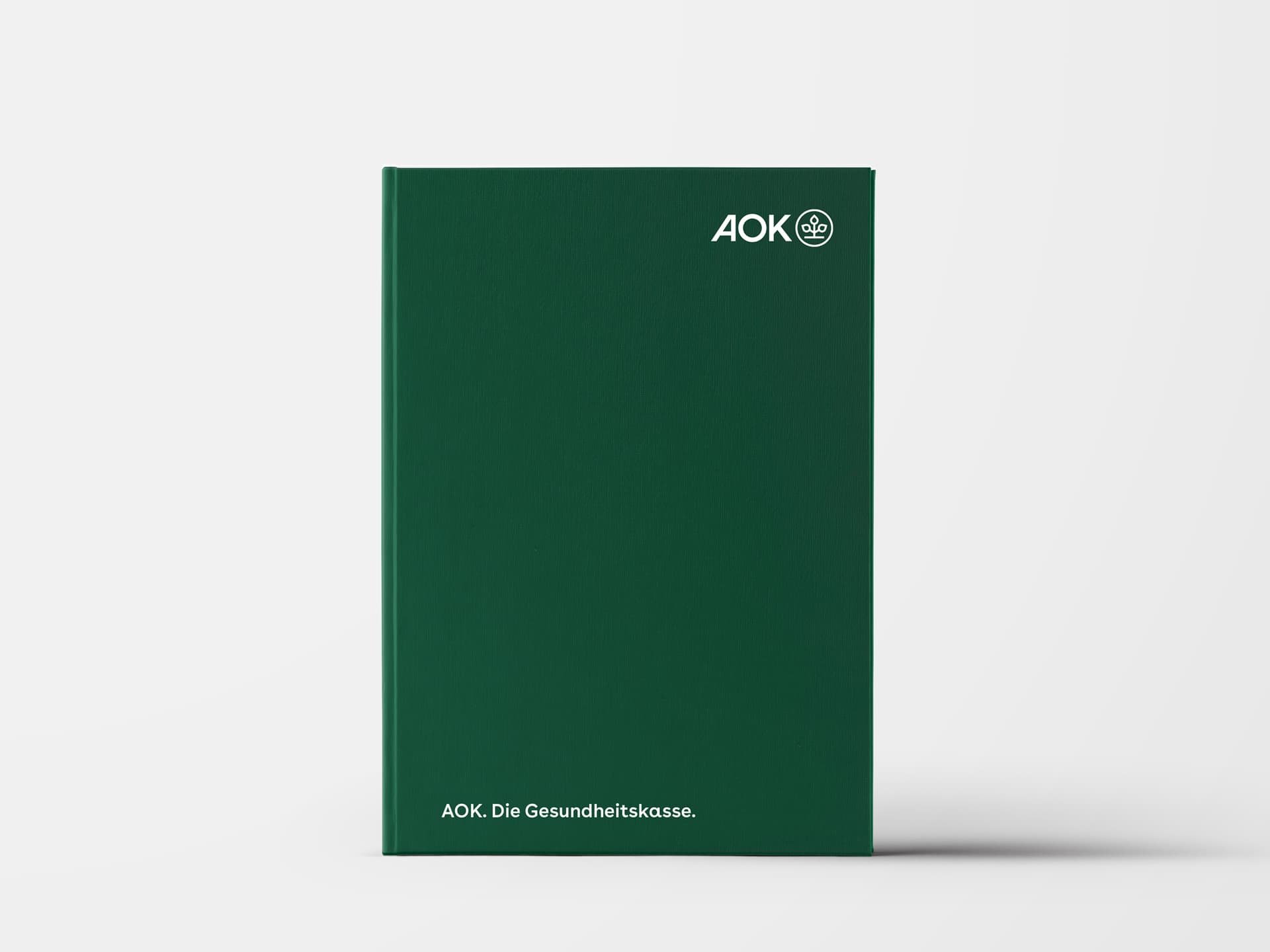


We created a revitalized color palette that pays homage to AOK’s green heritage, optimized for digital applications, and designed to meet high accessibility requirements.


Expressing diversity, warmth and inclusion through imagery and a custom illustration style.


AOK is a large organization with 11 individual entities and numerous departments and partners. I created and hosted webinars to train and help the talented people who bring the brand to the street every day, so they can make the most of the new identity system.
